Animation Architecture in Velo™: Building Smooth UX at Scale

If you’ve ever built a chat interface, activity feed, or onboarding flow where content keeps growing over time, you’ve probably run into animation issues. Things start out fine with a handful of components, but as the UI grows, animations get noisy, scroll behavior becomes unpredictable, and performance starts to suffer. The challenge isn’t adding motion. It’s deciding when to animate, what should move, and how to keep everything feeling stable as the interface scales.
When we built the dynamic rendering system for Velo™, we realized pretty quickly that animations weren’t just a nice-to-have. They were essential for creating a polished, professional experience. The harder problem was making those animations perform well at scale, especially in a chat-like interface that can render hundreds of components over time.
This post breaks down how we approached that problem and built an animation architecture that stays smooth and predictable without overcomplicating the developer experience.
Core Animation Challenges We Solved
Before diving into the solution, it’s worth calling out the problems we were trying to solve.
- Performance at scale: How do you animate dozens of UI components without janky scrolling or dropped frames?
- Context-aware animations: New content should animate in, but existing content should stay stable when users scroll back through earlier content.
- Parallel vs sequential motion: When should components animate together, and when should they appear one after another?
- Viewport optimization: Why animate things the user can’t even see?
- Animation coordination: How do you track when animations finish across nested components without things getting tangled?
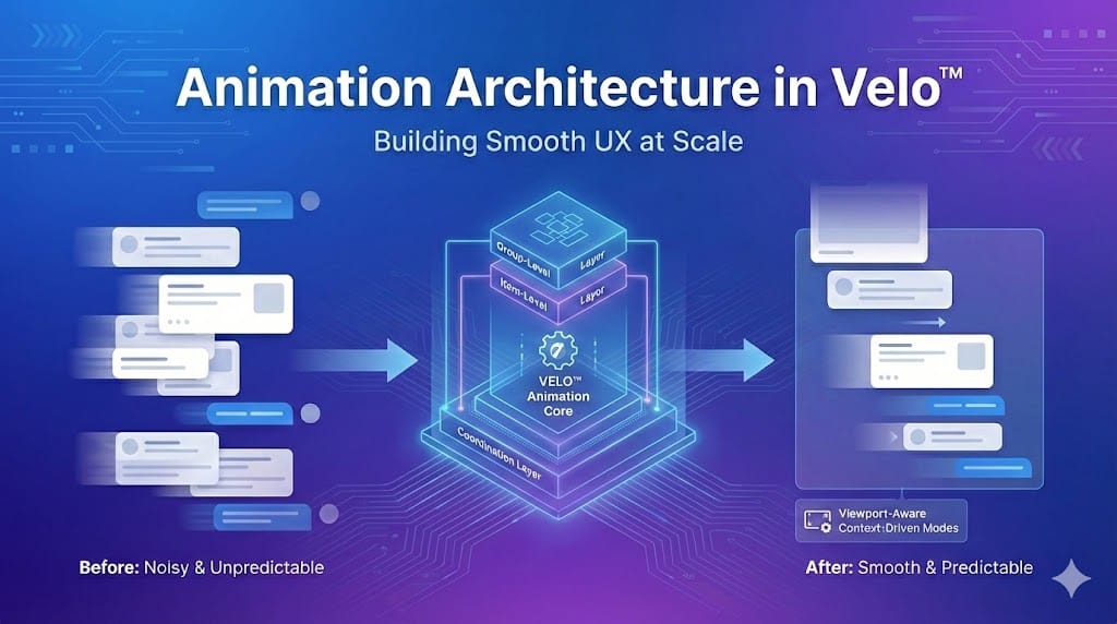
To keep the system understandable as it grew, we ended up separating animation responsibilities into three layers: how groups of components appear, how individual items animate within those groups, and a coordination layer that manages timing and sequencing across the UI.
The Three-Tier Animation System
We structured the animation system into three clear layers, each responsible for a different part of the experience.
- Group-level animation: Controls how sets of components appear and how groups are staggered relative to each other.
- Item-level animation: Handles the animation of individual components within a group.
- Coordination layer: Manages when animations start and how quickly they run so animations stay smooth as the UI grows.
Key Animation Concepts
A few ideas come up repeatedly throughout this post:
- Animation mode determines how the UI animates based on context, such as loading history or adding new content.
- Instruction groups are sets of components that animate together.
- Sequential animation means components appear one after another rather than all at once.
- Completion tracking lets the system know when one animation finishes and the next should begin.
Animation Modes: Context-Driven Behavior
One of the most important decisions we made was treating animation behavior as context-dependent. The same UI shouldn’t animate the same way in every situation. Loading history, adding new content, and starting a conversation all call for different behavior.
To support that, we defined three animation modes, each optimized for a different moment in the user journey.
HistoryLoad — Loading existing conversation history
No animation; content appears immediately. Resumes context quickly without visual noise.
NewContent — Adding new content to an active session
Only new components animate; existing content stays put. Highlights what's new while keeping context stable.
Initial — First-time conversation load
Components animate in sequence. Creates a clear and engaging first impression.

The names aren’t important. What matters is that animation behavior changes based on why content is being rendered.
Sequential Animation: The Choreography System
Instead of animating everything at once, we treat each instruction group as a small choreography. Components appear one at a time, which creates a calmer, more controlled flow, especially in longer conversations.
At a high level, the system tracks which component is currently animating and only reveals the next one once the previous animation finishes. This keeps motion ordered rather than chaotic.
Coordinating Completion
Whenever possible, components signal when they’ve finished animating. When that signal arrives, the system advances to the next component in the sequence.
Not all components can reliably report completion, so we also support fallback timing. In those cases, the system advances based on conservative, component-specific delays. The key lesson is simple: never assume every component can report its own animation lifecycle.
Viewport-Aware Sequencing
Sequential animations are also viewport-aware. Components animate only once they enter the visible area of the screen, which avoids wasted work and prevents surprising motion when users scroll through earlier content.
Component-Level Animation Coordination
Not all components have simple, one-shot animations. Some manage internal sequences, like progressively revealing content or animating text over time. These components need a way to coordinate with the larger system to prevent overlapping or cut-off animations.
A good example is a checklist-style component that reveals items one by one and transitions to a completed state only after the full sequence finishes.
To support this, we use a simple coordination contract:
- shouldAnimate: Tells the component whether it should animate or render its final state immediately.
- onAnimationComplete: Allows the component to signal when it’s truly finished.
Components that don’t support this contract fall back to conservative timing so the sequence can continue without blocking.
The renderer doesn’t need to know how a component animates - just when it’s done.
The key takeaway is that complex components manage their own motion, but the system stays in control of sequencing.
Animation Variants: Multiple Personalities
Rather than using a single animation everywhere, we define a small set of purpose-driven variants, each tuned for a specific type of content and interaction.
Fade is used for text-heavy content. Motion is intentionally restrained, guiding attention without getting in the way of readability.
Other variants follow the same idea:
Slide for cards and interactive elements where directionality matters.
Grow for expanding or space-creating content like lists and grouped items.
The key constraint is simple: motion is chosen based on content intent, not applied uniformly.
Smart Scroll Coordination
Animations and scrolling need to cooperate. If scroll behavior feels unpredictable, even good animations quickly become frustrating.
Scroll behavior adapts based on what’s being rendered and why:
- History load: Conversation history appears immediately and the view scrolls to the bottom.
- User response added: The interface scrolls smoothly to acknowledge the action.
- New system content: New content is brought into view without disturbing the existing context.
Scroll timing loosely adapts to content complexity, which helps longer sequences feel deliberate instead of rushed.
Viewport-Aware Polish
If the user has scrolled up, the system avoids snapping them back to the bottom. Instead, it surfaces subtle visual cues when new content appears below the fold.
Performance Optimizations That Matter
Coordinating animations, scrolling, and rendering at scale requires careful state management.
- Decoupled state: Animation progress and scroll behavior are tracked independently to avoid race conditions.
- Ref-based tracking: Animation state lives in refs rather than React state, which prevents unnecessary re-renders.
- Bounded delays: Animation timing is capped so delays don’t scale linearly as conversations grow.
By keeping animation coordination out of React’s render cycle, the system stays responsive even as UI complexity increases.
Lessons Learned & Gotchas
Letting animation behavior adapt to context removed a lot of edge cases. Sequencing components instead of animating everything at once consistently felt more controlled, especially in longer interactions. Viewport awareness delivered meaningful performance gains, particularly on mobile. And for complex components, conservative fallbacks proved essential.
There are also things we’d approach differently next time. We’d invest earlier in content-specific animation presets, introduce performance monitoring sooner, and build better debugging tools for animation timing issues.
Finally, a few pitfalls to avoid:
- Animating everything all the time creates noise and hurts performance.
- Off-screen animations waste resources.
- Mixing animation state with component state leads to unnecessary re-renders.
Context-driven logic, reliable fallbacks, and early testing on lower-end devices go a long way toward keeping the system predictable and resilient.


